Arches Music FEstival
Arches Music Festival Poster & VIP Pass

My Design Process and Iterations
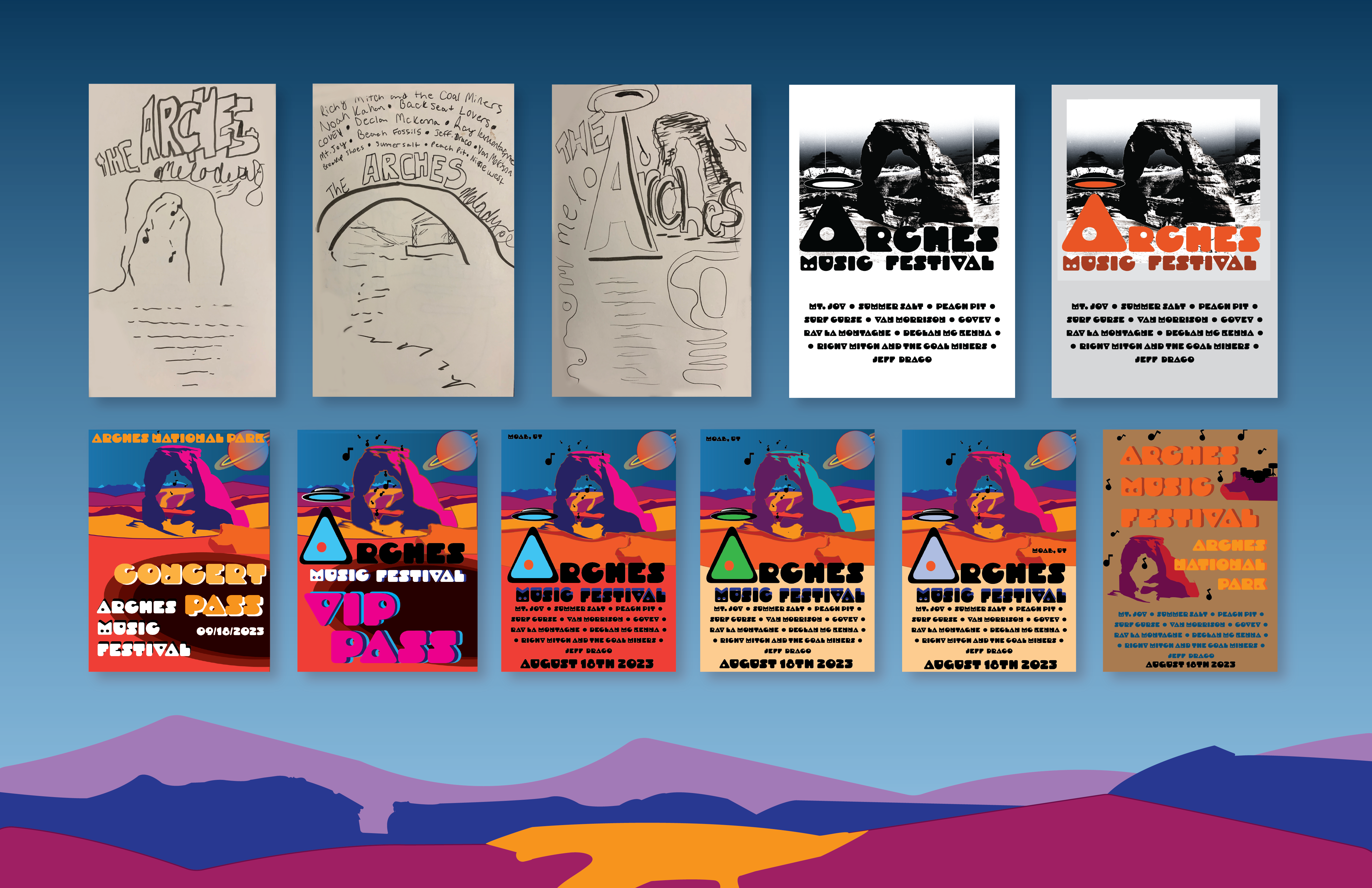
For this music festival poster I created a theoretical musical experience set in Arches National Park similar to Red Rocks and other outdoor amphitheater’s. My goal was to connect humans, nature, and music together in one space creating a monumental musical experience. My early sketches demonstrate my use of scale and typography to create a larger than life, out of this world theme incorporating the parks famous arches.
This project was also heavily inspired by 60’s retro posters, for instance some of the Grateful Dead at Red Rocks poster designs. This 60’s Typographic style was a huge influence on my design. Back in the 60’s alot of the type was hand lettered or customized. I wanted to do something similar while maintaining my “out of this world” theme, so I chose the typeface shown below, Droog Heavy, incorporating both a chunky typeface with futuristic undertones.

Color Choices
I knew from the beginning I wanted bright color choices to make the poster pop. Arches National Park is full of rich oranges, reds, and yellows, this was my primary color pallet in the beginning of my design process. I also knew since I was incorporating an out of this world alien vibe I would probably be using greens and blues as contrast. The iterations above show my experimentation with these colors, as well as various type hierarchy configurations.


